What Exhaustion Looks Like Before the Reversal
What does exhaustion look like before a price reversal?
Trends deteriorate before they reverse, and the deterioration shows up across three signals before price structure breaks. Swing duration expansion: each successive push takes longer while covering less ground (15 minutes for 80 points, then 27 for 60, then 41 for 35). Velocity deceleration: the rate of price change drops across consecutive swings even though direction holds — when velocity falls below 30% of its peak while price still makes new highs, the move is statistically empty. Combined extremes: when velocity, swing duration, and acceleration all hit statistical extremes simultaneously, the reversal is already in the data before the chart confirms it.
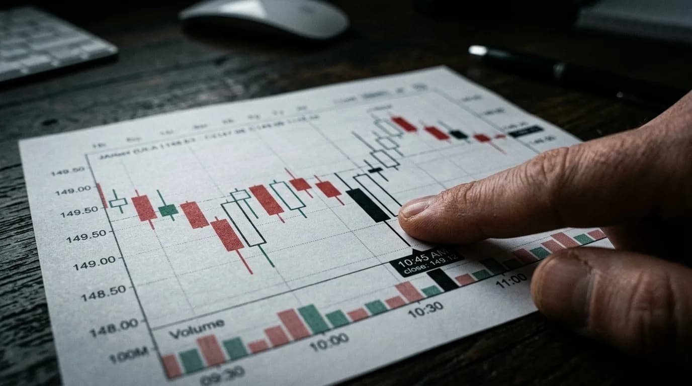
Two strong green candles, the chart looking clean, structure intact, indicators green, no warning signs anywhere. Then price reverses sharply and gives back everything in half the time it took to build.
In hindsight it always looks obvious. The move was running out of energy. Here's what that actually looks like in the data before the chart confirms it.
Exhaustion Has a Fingerprint
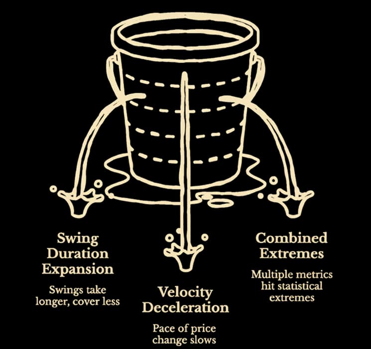
Trends don't reverse instantly, they deteriorate first, and that deterioration is measurable across three signals that appear before price structure breaks. When two or more of these align, the move is in its final stage regardless of what the chart looks like.
- Signal one: Swing duration expansion. In a healthy trend, swings have rhythm, with each push taking roughly similar time to cover roughly similar distance. When that rhythm breaks, exhaustion is already underway. The tell is a sequence where each successive swing takes longer while covering less ground. Fifteen minutes to gain 80 points, then 27 minutes for 60 points, then 41 minutes for 35 points. The chart still shows higher highs, but the clock says the trend is spending itself. More time, less output — the market is running into progressively more resistance with each push, even though price hasn't shown a lower high yet.
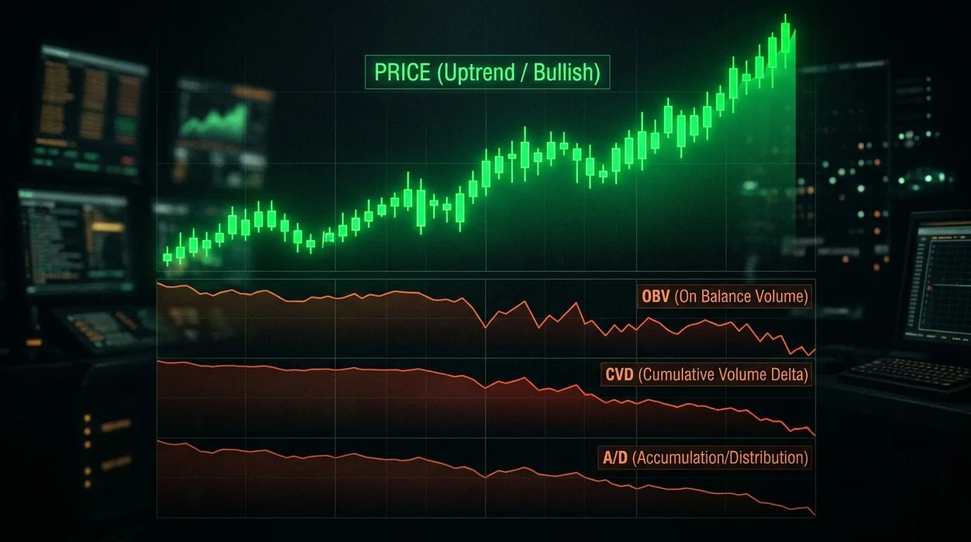
- Signal two: Velocity deceleration. Velocity measures the rate of price change between swing points, how fast the move is covering ground expressed as a session percentile so it's calibrated to today's conditions. In the early stages of a healthy trend, velocity is expanding or stable. In exhaustion, it decelerates across consecutive swings, not because direction has changed but because the pace behind the direction is dying. When velocity drops below 30% of its peak reading while price is still making new highs, the move is running on momentum that's already gone — one of the core exhaustion conditions Draconic watches for ahead of a reversal. The direction is intact on the chart, but the energy that produced it isn't.
- Signal three: Combined extremes. Individually, each signal is informative. When multiple metrics hit statistical extremes simultaneously, velocity at the 95th session percentile, swing duration at twice the session average, acceleration z-score compressing toward zero, that convergence is the exhaustion cluster. No single number causes the reversal. The simultaneous deterioration across independent dimensions is what confirms it.
The Signal Most Traders Miss
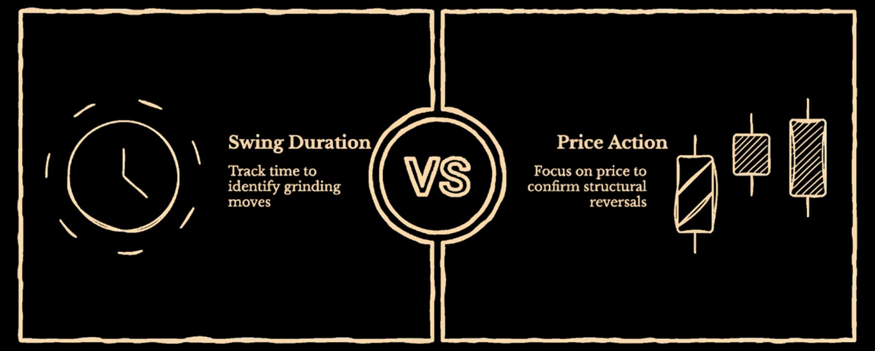
Of the three, swing duration expansion is the most consistently overlooked, and the reason is simple: it requires tracking time, not just price. Standard charts show where price went, but they don't show how long each leg took to get there.
The practical tell is straightforward: if the current swing has already taken twice as long as the previous two, and price hasn't covered meaningfully more ground, the move is grinding. Not reversing yet, but the buyers that should be pushing price higher with urgency aren't there in the same numbers. The sellers absorbing each push are multiplying.
When a counter-swing, a pullback against the trend direction, starts moving faster than the advance it's pulling back from, the reversal has effectively already happened in the data. Knowing that in real time changes whether you're holding a winning position or watching it give back.
What to Do With This
The exhaustion signals don't tell you when to exit. They tell you that the risk profile of holding has shifted, and that new entries in the trend direction are lower probability than they were two swings ago.
In practice: when swing duration is expanding and velocity is decelerating across consecutive swings, tighten targets. Remove the assumption that the trend has more room. If combined extremes appear simultaneously, the position deserves active management rather than passive holding.
Draconic, an AI trading intelligence platform, surfaces these signals in real time, tracking swing duration, velocity session percentile, acceleration state, and combined extremes simultaneously so the exhaustion pattern is visible as it develops, not after the chart confirms the turn.
The chart shows you what happened, but the exhaustion signals show you what was already happening underneath long before price confirmed it. The reversal you didn't see coming was in this data. Most of the time, it is.
More like this
May 12, 2026behind-the-price
Sector Rotation — The Macro Signal Most Traders Ignore
The Draconic Team • 3 min
May 11, 2026behind-the-price
How Market Makers Create Invisible Floors and Ceilings
The Draconic Team • 11 min
May 8, 2026behind-the-price
The Magnetic Levels — Why Price Gets Drawn to Certain Numbers Near Expiry
The Draconic Team • 8 min
May 7, 2026behind-the-price
When Three Flow Signals Agree Against Price
The Draconic Team • 4 min